overlay histogram distributions using seaborn or matplotlib


In this example, we show two methods to overlay histogram distributions using seaborn and matplotlib separately.

import library

import numpy as np
import pandas as pd
import seaborn as sns
from matplotlib import pyplot as plt

generate some data for histgram

list1 = np.random.randint(100,size=1000)
list2 = np.random.randint(200,size=1000)

# also getthem into a dataframe into one column, but add a second column to label source
list = np.concatenate([list1,list2])
lables = ['l1']*len(list1)+['l2']*len(list2)
d = {'x':list,'label':lables}
df = pd.DataFrame(d)
display(df)

x label
0 49 l1
1 93 l1
2 38 l1
3 96 l1
4 32 l1
... ... ...
1995 18 l2
1996 102 l2
1997 1 l2
1998 175 l2
1999 77 l2

2000 rows × 2 columns

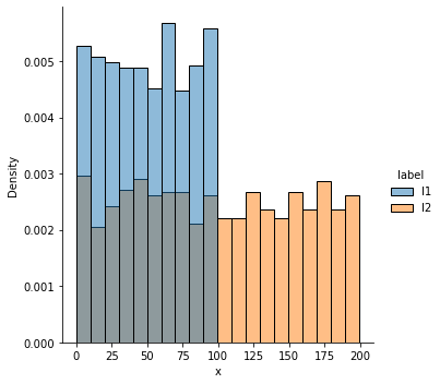
method 1, overlay dataframe columns with different labels

sns.displot(df, x="x", hue="label", stat="density")
<seaborn.axisgrid.FacetGrid at 0x24b5c685988>

png


method 2, overlay two seperate lists into histograms using matplotlib

plt.figure(figsize=(8,6))
plt.hist(list1,bins=20, alpha=0.5, label="data1")
plt.hist(list2, bins=20, alpha=0.5, label="data2")

plt.xlabel("Data", size=14)
plt.ylabel("Count", size=14)

plt.title("Multiple Histograms with Matplotlib")
plt.legend(loc='upper right')
<matplotlib.legend.Legend at 0x24b5face788>

png


Author: robot learner
Reprint policy: All articles in this blog are used except for special statements CC BY 4.0 reprint policy. If reproduced, please indicate source robot learner !
  TOC