When visualizing data with Matplotlib in Python, it’s common to run into the issue of cluttered x-axis or y-axis ticks. Especially for dense time series data, the axis can become a confusing jumble of overlapping labels. The good news? Matplotlib offers easy-to-use tools to help you make your plots clearer and more professional-looking. Today, we’re diving into a simple approach to declutter your x-axis ticks, focusing on time series data.
Problem Statement
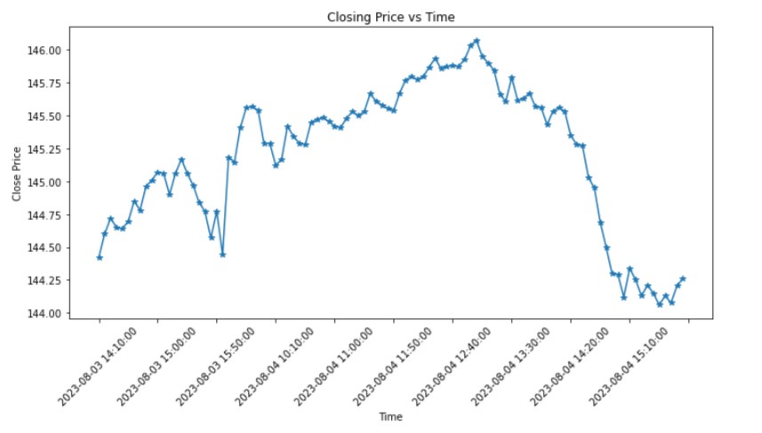
Consider you have time series data, say, stock closing prices sampled every 5 minutes. If you try to plot the closing prices against time directly using Matplotlib, you’ll probably get an x-axis swamped with tick labels, especially for long trading sessions. This makes the plot less readable and, at times, counter-productive.
import matplotlib.pyplot as plt |
If you’ve done something similar, you know that the result can be less than ideal: overlapping x-tick labels.
The Solution: Adjusting X-Ticks
Luckily, Matplotlib provides the tools we need to make our x-axis more comprehensible.
Step 1: First, import the necessary libraries:
from matplotlib.ticker import MultipleLocator |
Step 2: Determine the number of ticks you want on your x-axis. A general guideline might be to aim for 5-10 ticks for clarity, but this can vary based on the length of your dataset and the specific context.
n = len(times) // 10 # Display approximately 10 x-ticks |
Step 3: Set the tick locator for the x-axis using the MultipleLocator:
ax = plt.gca() # Get the current axes |
After these steps, the modified code will look something like:
import matplotlib.pyplot as plt |
Now the plot will looks something like this, much better: